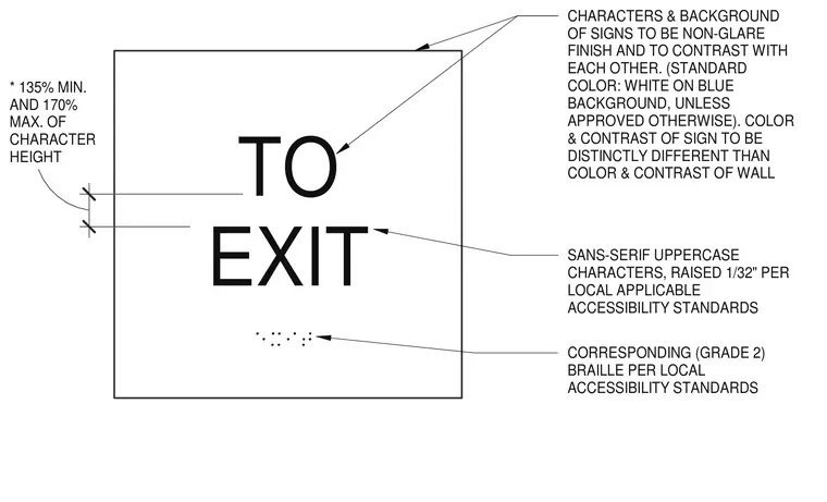
The sign features sans-serif uppercase characters raised one thirty-second of an inch per local applicable accessibility standards, accompanied by corresponding Grade 2 braille. Characters and background possess a non-glare finish with contrasting colors, standardly specified as white on a blue background unless approved otherwise. The color and contrast of the sign must remain distinctly different from the supporting wall surface. Character heights measure between one hundred thirty-five percent minimum and one hundred seventy percent maximum relative to standard scaling.
EXIT TO * 135% MIN. AND 170% MAX. OF CHARACTER HEIGHT CORRESPONDING (GRADE 2) BRAILLE PER LOCAL ACCESSIBILITY STANDARDS SANS-SERIF UPPERCASE CHARACTERS, RAISED 1/32" PER LOCAL APPLICABLE ACCESSIBILITY STANDARDS CHARACTERS & BACKGROUND OF SIGNS TO BE NON-GLARE FINISH AND TO CONTRAST WITH EACH OTHER. (STANDARD COLOR: WHITE ON BLUE BACKGROUND, UNLESS APPROVED OTHERWISE). COLOR & CONTRAST OF SIGN TO BE DISTINCTLY DIFFERENT THAN COLOR & CONTRAST OF WALL
Members view this detail in full resolution, download the CAD files (SVG, PDF), and can adapt it in the built-in CAD editor — export DXF, DWG, or PDF.
Start membership